
Over the next four weeks we’re going to take a more in depth look at the main features of ithlete Pro in the form of Tuesday Tips. This week we’re starting with the interactive timeline.
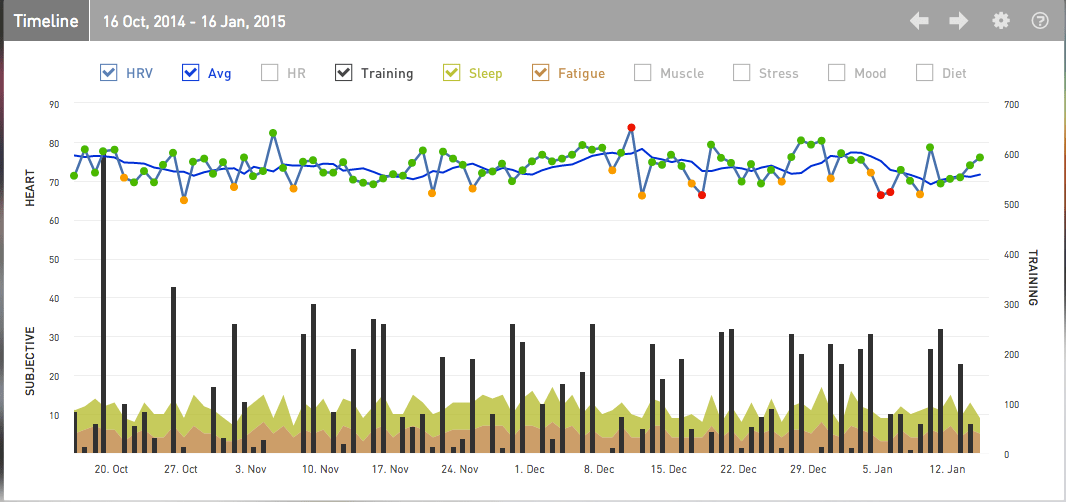
The timeline is right at the top of your screen when you open ithlete Pro, this interactive chart is the starting point for flexible data analysis.
By selecting one or more of your subjective data points (sleep, fatigue, muscle soreness, stress, mood and diet) it is easy to visualise patterns and relationships. For example you might display training load, diet and heart rate variability (HRV) to investigate whether your eating habits are responsive to training load and what impact the two have on HRV and recovery. Another example might be to show just sleep, fatigue, training loads and the HRV rolling average to see how long it takes you to recover, as well as how tired your training is making you feel. This type of information can be hugely helpful as once you become aware of a trend or habit it is much easier to control.
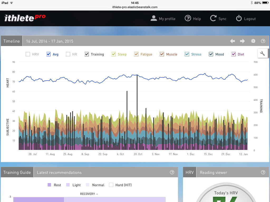
The timescale can be adjusted between a month and a year where you can then scroll backwards and forwards across up to two years of data (if you already have that much!). By reviewing past data you can see trends in HRV and click on individual score to be reminded of the comments you recorded. This is great for looking back to see where you were this time last season in comparison to now – what are you doing differently? Where was your high point? How can you use this information to get more out of this season? Another neat feature of the ithlete Pro timeline is the ability to edit comments and add flags. You might want to flag major events, bouts of illness or periods of great performance.
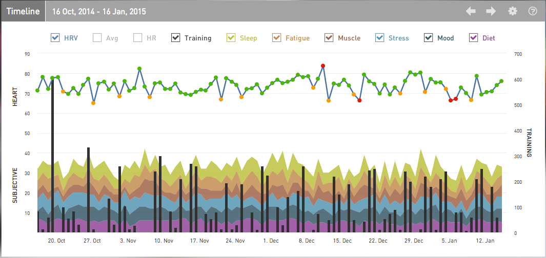
You can choose to have all data showing on the ithlete Pro timeline at once, but this is unlikely to allow your eyes & brain to start spotting relationships or trends. The default setting excludes the HRV rolling average and resting heart rate which makes it easier to start spotting the relations between data.
By narrowing down the time period you can better look in detail at the factors relating to peaks in HRV. A great example is when looking back at when a really good nights sleep gives you a boost the next day. Alternatively a longer timescale, for example 6 month, might show whether periods of high HRV coincided with good event performances – as they did in this example on 19 Oct.
We’d love to hear what you’ve discovered using the ithlete Pro Timeline or any other comments about this feature.
Don’t forget to follow ithlete on Facebook or Twitter to see the rest of the series!
Hello,
I am enjoying ithlete Pro for the last 2 weeks and I have a couple of questions regarding how to make the most of it
1. How are the 4 quadrants graded and what is the zero point on both axis?
2. Regarding the training load, I am putting in the load from the previous day each morning when I take my HRV. Is that correct or should I go back and input the training load each evening for that day?
Thank you
Padraig
Hi Padraig,
Thanks for your comment and great timing – we’ve just published the next blog post in the series Tuesday Tip: The ithlete Pro™ Training Guide which will explain the quadrants in more detail.
As for the training load it is really down to personal preference. We tend to prefer to add training load later in the day, or retrospectively edit yesterdays comments when doing a morning reading, however entering the previous days load on today’s score is fine too so long as you are consistent.
Hope that helps and if you’ve any more questions do let us know!
Thanks,
Laura
Thank you Laura. I just read today’s tip and found it very helpful.