
Camp Digital
We were invited to present at a User Experience event called Camp Digital in Manchester by the designer Chris Bush who helped us realise the v3.0 UI (user interface) design of ithlete.
This was the first time I had presented to (several hundred) User Experience experts. I decided to tell the story of ithlete from having the idea back in 2009 to v3.0 and the ithlete Finger Sensor at the start of 2014. Feel free to check out the slides we used here: Simon Wegerif Camp Digital Presentation.
Back to the start
I explained that the original invention (for which we have just been granted the US patent) was really all about creating a good user experience i.e. the one minute measure that anyone can fit into their daily routine, the traffic lights, charts and ithlete scale, and now the ability to correlate lifestyle factors such as sleep & diet with the objective HRV score.
I showed how the UI had evolved to make the app more intuitive to use and to place emphasis on key aspects of the operation (such as the breathing pacer) and feedback (colour coding the HRV score) but without dumbing down the detail for more advanced users who want that.
User feedback feeds development
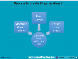
I also described the process of user feedback, from beta users before the first app version was released to the hundreds of pieces of user feedback that we incorporated into the latest v3.0, and which also led to the development of the Finger Sensor. Audience member @kategiffard tweeted ‘feedback turned @myithlete from clumsy chest strap to finger sensor of heart rate FEEDBACK is vital’.
After describing the features of the v3.0 UI that resulted from feedback in more detail, I also gave a live demo using AirServer, which elicited responses such as @Digitangle ‘Pretty sure the audience’s breathing has just synchronised watching the demo!’
There were also some very flattering tweets about the presentation itself such as @quiffboy ‘Launches into a live @myithlete app demo with no technical glitches. Awesome stuff. Even taking q+a at same time. Very slick. #campdigital’
Summary
I also took advantage of the assembled wisdom on UX to pose some questions to the audience, such as ‘how often should you update an app?’, to which Scott Byrne-Fraser, Creative Director for BBC Sports Olympics coverage suggested that their user testing revealed that users like frequent updates (it keeps things interesting).
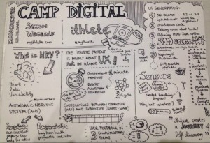
Following the event attendee Anna Tamasi of Blue Latitude summed up the presentation itself far better than we ever could, check out her sketch notes!
Although a little nervous beforehand at the prospect of speaking to an unfamiliar audience I really enjoyed the whole experience, and even met Ben Lowe who has created an excellent Strava analysis app called veloviewer for us nerdy cyclists!
Would we go again? Absolutely, we loved it! Thanks Camp Digital.
by Simon Wegerif